WPBakery Power Patterns: Building Fast, Accessible Pages without Bloat
If you build with WPBakery, this is for you. We’ll share patterns to keep pages fast and accessible without extra bloat.
Why Patterns Matter
Reusability and consistency
Using standardized WPBakery patterns saves time, reduces errors, and keeps your site’s performance and accessibility on track. When you copy-paste tested blocks instead of reinventing layouts every time, you avoid common pitfalls like excessive nesting, missing alt text, or inline styles that bloat page weight.
For sites with multiple editors or developers, shared patterns also ensure brand consistency and make onboarding faster. You’ll see improvements in Core Web Vitals (CWV) metrics like Interaction to Next Paint (INP) and Cumulative Layout Shift (CLS) when you stick to lean, tested structures.
Hero Pattern
Single-column hero with CTA
The hero pattern is your page’s first impression. Keep it simple: a headline (H1), a short lead paragraph, and a clear call-to-action button. Avoid heavy background videos or auto-playing media that hurt LCP and accessibility. If you are comfortable with HTML, you can also use an anchor tag (“<a>”) with a theme-wide defined class to make the link appear and behave link a button.
Example structure:
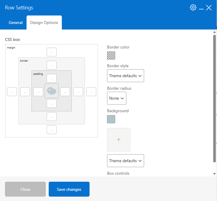
Row Settings
Using a color background instead of an image or video:
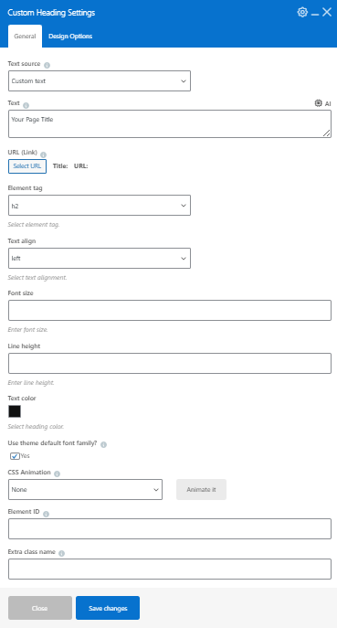
Heading Settings
Simple Heading settings that use theme fonts for both consistency and less overhead.
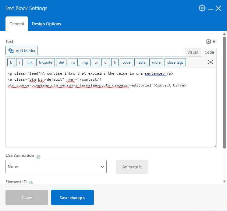
Text Settings
Short lead paragraph and clear call to action link (using CSS class to display as a button)
The result:
Your Page Title
A concise intro that explains the value in one sentence.
Why this works: Minimal markup, semantic HTML, and consistent CTA styling via theme classes. No inline styles or unnecessary wrapper divs.
Two-Column Pattern
Text and image side-by-side
For balanced content and imagery, use a two-column layout. Put text in one column and a supporting image in the other. The single image element loads the image along with the srcset (source sets) for proper image sizing for each device.
Example structure:
Row and Column settings
You can use the column selector to choose the columns you wish to have in the row (note: by default, WP Bakery uses the full width at screen sizes below 480px).
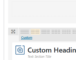
Image Settings
Using the single image element:
Example of HTML rendered with srcset:
<img decoding="async" width="1200" height="700" src="https://tworowstudio.com/wp-content/uploads/2026/01/wpb-template-library.png" class="vc_single_image-img attachment-full" alt="" title="wpb-template-library" srcset="https://tworowstudio.com/wp-content/uploads/2026/01/wpb-template-library.png 1200w, https://tworowstudio.com/wp-content/uploads/2026/01/wpb-template-library-300x175.png 300w, https://tworowstudio.com/wp-content/uploads/2026/01/wpb-template-library-1024x597.png 1024w, https://tworowstudio.com/wp-content/uploads/2026/01/wpb-template-library-768x448.png 768w" sizes="(max-width: 1200px) 100vw, 1200px">
SEO Hint
When looking at a page on a mobile device, you may wish an image that is on the right of the text to appear before the text. In this case, you will need to create a column that is displayed only on mobile devices that precedes the text and another that is hidden following the text. This method prevents duplicated text on the page – which can lower your attractiveness to search engines.
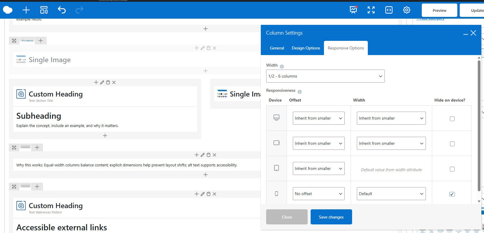
example result:

Section Title
Subheading
Explain the concept, include an example, and why it matters.

Why this works: Equal-width columns balance content; explicit dimensions help prevent layout shifts; alt text supports accessibility.
References Pattern
Accessible external links
When citing sources or linking to external documentation, use a dedicated References section with properly formatted links. All external links should open in a new tab (target="_blank") and include rel="noopener" for security and user experience.
Example structure:
References
Why this works: Consistent link behavior; security via rel="noopener"; accessibility via clear link text.
Accessibility Basics
Headings and hierarchy
Use a single H1 per page, then H2/H3 for sections. Avoid using bold text in place of headings; rely on semantic tags. Screen readers use heading hierarchy to navigate, so proper structure is essential for blind or low-vision users.
Keyboard and contrast
Ensure interactive elements (buttons, links, form fields) are reachable via keyboard (Tab key). Test focus indicators and make sure they’re visible. Check color contrast ratios using browser dev tools or dedicated accessibility checkers—text should meet WCAG AA standards (4.5:1 for normal text, 3:1 for large text).
Alt text and labels
All images require descriptive alt text. Forms need clear labels and error handling that is announced to assistive technology. Missing alt text is a common accessibility fail—don’t skip it.
Performance Guardrails
Limit nesting
Deeply nested rows and columns inflate DOM size and hurt INP. Flatten structure and reuse common layouts. If you find yourself nesting three or more levels deep, step back and simplify.
Image sizes
Match image dimensions to containers; provide srcset and sizes for responsive delivery. Avoid auto-scaling massive images in CSS—this wastes bandwidth and slows LCP.
References
Key Takeaways
-
-
-
- Use standardized hero, two-column, and references patterns for speed and consistency.
- Avoid deep nesting to protect INP.
- Ensure accessibility with proper headings, labels, alt text, and contrast.
- Right-size images and include responsive
srcsetto avoid CLS.
-
-
