Website Design for Your Audience: Part 3 – Navigation & User Flows
You’ve researched your audience and architected your information. Now comes the execution: designing actual navigation and user flows so visitors move through your site intuitively toward conversion. This part walks you through creating navigation patterns, designing page templates, and mapping the user journeys that guide visitors from arrival to action.

This is Part 3 of the Website Design for Your Audience series—a five-part guide covering the complete process of designing a site around the people you’re trying to reach. Catch up on earlier parts: Part 1: Discovery & Research | Part 2: Information Architecture.
The Difference Between Architecture and Navigation
You might think architecture and navigation are the same thing. They’re not.
Architecture (Part 2) is the invisible structure: how you categorize and organize content conceptually.
Navigation is how you reveal that structure and guide visitors through it: the menu, buttons, breadcrumbs, and internal links that help visitors find what they need.
You can have great architecture but poor navigation (buried CTA, unclear menu labels, no breadcrumbs), and visitors stay lost. You can have mediocre architecture but great navigation (clear menus, strategic CTAs, helpful prompts), and visitors still convert.
This section focuses on navigation design and implementation—the UX layer that brings your architecture to life.
Navigation Pattern 1: Global Navigation (Header Menu)
Your header menu is the primary way visitors find major sections. Design it thoughtfully:
Placement and Behavior
Sticky (stays visible on scroll): For sites with longer pages, sticky headers keep navigation accessible. This is especially important on mobile where scrolling is common.
Mega menu (on hover): If you have sub-pages, use a mega menu or dropdown. When a visitor hovers (desktop) or taps (mobile) on a menu item, reveal relevant sub-pages. This reduces clicks and shows visitors your depth without overwhelming them.
Mobile hamburger menu: On mobile, stack navigation in a hamburger menu (three horizontal lines icon) that expands on tap. Keep the expanded menu organized and tap-friendly (items should be at least 44px tall for comfortable mobile interaction).
Menu Item Naming
Use your audience’s language (from Part 1). Tests:
- “Services” vs. “Solutions” vs. “What We Do”: Ask your audience which word they’d click. Different words resonate differently.
- “Blog” vs. “Insights” vs. “Resources”: Blog signals casual content; Insights signals expertise; Resources signals usefulness. Choose based on your positioning.
- Action-oriented labels: “Get Started,” “Schedule a Demo,” or “Explore Plans” are clearer than generic “Products” or “Pricing.”
Avoid:
- ❌ Overly clever names (“The Forge” instead of “Services”)
- ❌ Acronyms visitors don’t know
- ❌ Internal jargon (use “Projects” not “Engagements”)
Menu Depth
Keep primary menu to 4–7 items. Use submenus for depth. A sticky rule: No more than 3 clicks to reach core information.
Navigation Pattern 2: Contextual Navigation (Breadcrumbs + Sidebars)
As visitors move deeper into your site, contextual navigation helps them understand where they are and move back/forward.
Breadcrumbs
Show the path: Home > Services > Web Design > Article Title
Benefits:
- Visitors understand their location in your site hierarchy
- Clickable breadcrumbs let them jump back to parent pages easily
- Search engines use breadcrumbs to understand your site structure (better SEO)
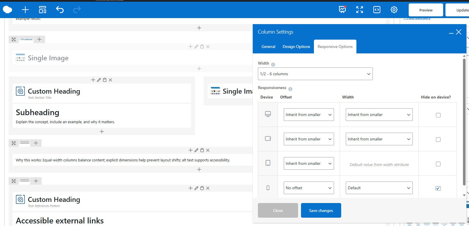
Implement breadcrumbs with a dedicated plugin (Yoast SEO and All in One SEO both include breadcrumb options) or manually in your theme template. In WP Bakery—our preferred page builder—add a text element at the top of each page template with HTML-formatted breadcrumbs:
<nav aria-label="breadcrumb"><a href="/">Home</a> > <a href="/services/">Services</a> > <span>Web Design</span></nav>
Related Links / Sidebar Navigation
On service pages or detailed articles, include “Related” or “Next Steps” sections that link to complementary content:
- Service page: Include a “Next Steps” CTA linking to case studies, pricing, or schedule a call
- Blog post: Include “Related Articles” section linking to related posts; link to the service/product the post relates to
- Product page: Include “What’s Included” section, then links to FAQ, Getting Started guide, or support page
This “next step” linking guides visitors toward conversion and extends engagement (they find more to read, reducing bounce rate).
Navigation Pattern 3: Calls-to-Action (CTAs) and Conversion Paths
CTAs are the most important navigation elements. They guide visitors toward desired actions (book a demo, sign up, contact, purchase).
CTA Placement Strategy
Don’t bury CTAs at the page bottom. Place them strategically:
- Hero section (top of page): Primary CTA; what you want them to do first. Example: “Book Your Free Consultation” or “Explore Our Plans.”
- After key sections: After explaining a major value proposition (e.g., after describing what makes you unique or why a feature matters), add a CTA: “Learn More,” “See It in Action,” “Schedule a Demo.”
- Sidebar (on long pages): Repeat your primary CTA in a sticky sidebar on desktop (appears even as visitors scroll). Mobile visitors see it at the bottom.
- Page footer: Last chance CTA; visitors scrolling to the bottom are highly engaged. Don’t miss this moment.
- Blog post end: Always end blog posts with a CTA linking to the related service or next content. Examples: “Learn More About Performance Optimization,” “Schedule Your Free Website Audit,” or “Explore Our Hosting Plans.”
CTA Copy and Design
Make CTAs action-oriented and specific:
- ✓ “Book Your Free Audit” (specific, low-friction)
- ✓ “Get Started – No Credit Card Required” (removes objections)
- ✓ “See How It Works” (curiosity-driven)
- ❌ “Click Here” (vague, doesn’t communicate value)
- ❌ “Submit” (passive, impersonal)
Design CTAs to stand out: Use contrasting color, clear icon (arrow, checkmark), and adequate size for easy clicking. Button height should be at least 44px on mobile for thumb-friendly tapping.
In WP Bakery, use HTML buttons with the `btn` class (provided by most themes). Example:
<a href="/contact/?utm_source=blog&utm_medium=internal&utm_campaign=editorial" class="btn btn-default">Schedule Your Consultation</a>
User Flow: From Awareness to Conversion
Think of user flow as the path from landing on your site to converting. Different audiences have different flows:
Research flow (new prospect): Lands on blog → Reads educational post → Sees “Learn More” CTA → Clicks to Service page → Sees social proof/pricing → Clicks “Book a Demo”
Comparison flow (active buyer): Lands on Services page → Scans offerings → Clicks on most relevant service → Reads details → Compares to competitors → Sees testimonials/case studies → Clicks “Contact Us”
Shortcut flow (warm lead, returning visitor): Lands on homepage or specific service page → Immediately sees “Book” CTA → Converts without browsing
Design for all three flows.** Your navigation should accommodate visitors at different stages, not force them down one path.
Designing Page Templates in WP Bakery
Different content types need different page templates. Here’s how to template them in WP Bakery:
Homepage Template
- Hero section: Value proposition, hero image, primary CTA
- Trust section: 3–4 logos, testimonials, or stats (builds confidence)
- Services/Solutions overview: 3–4-column grid of main services with “Learn More” links
- Why Us section: 3–4 key differentiators with icons
- CTA section: Strong secondary CTA (“Book Consultation,” “Get Started”)
- Social proof: Case study snippet or client testimonial
- Final CTA: Strong closing CTA + contact info
Service/Product Page Template
- Hero: Service name, value proposition, hero image, CTA (“Get Started,” “Schedule Demo”)
- Overview: What the service is, who it’s for, key benefits (2–3 paragraphs)
- Key sections: 3–4 main aspects of the service, each with icon, heading, and explanation
- How it works: Step-by-step process; builds confidence
- CTA: Mid-page CTA strengthens conversion intent
- FAQ: Address common questions/objections
- Related services: Link to complementary services
- Final CTA: Clear close (book, contact, etc.)
Blog Post Template
- Featured image: Hero image relevant to topic
- Meta info: Author, date, reading time (helps credibility and sets expectations)
- Lead/intro: 1–2 paragraphs succinctly explaining what the post covers and why it matters
- Content: Sections with headings, paragraphs, images, lists—break up text for scanability
- Key takeaways: Bulleted summary for skimmers
- CTA: Contextual CTA (e.g., blog post about design best practices → CTA links to Design Service page or book a design consultation)
- Related posts: 2–3 links to related blog posts for continued engagement
- Author bio: Brief author intro builds trust
Building in WP Bakery: Best Practices
Use rows and columns: A “row” spans full width; “columns” divide that space. Use 2–3 column layouts for most content. Limit to 1 column for text-heavy sections (easier to read).
Whitespace matters: Don’t crowd elements. Use generous spacing (padding/margins) between sections. Whitespace improves readability and visual hierarchy.
Consistent styling: Use theme fonts (avoid custom font families that add HTTP requests). Use theme’s button styles for CTAs. Consistency reinforces professionalism.
Mobile-responsive: WP Bakery elements should adapt to mobile. Test on mobile device; ensure buttons are tappable, text is readable, and images aren’t cropped awkwardly.
Performance: Avoid nested rows/columns that slow rendering. Use simple structures; save complexity for specific sections.
Testing Navigation: A/B Testing & User Feedback
Don’t assume your navigation is good without testing.
A/B Testing CTAs
If you have sufficient traffic, test different CTA copy, colors, or placements:
- Test “Book Free Consultation” vs. “Schedule a Call”
- Test button color (does a contrasting orange convert better than subtle gray?)
- Test CTA placement (mid-page vs. bottom only; sticky vs. non-sticky sidebar)
Tools like Plantomator or Optimizely enable A/B testing. Run each test for at least 2 weeks and 300–500 visitors per variant for reliability. Track conversion rate (clicks on CTA / total page visitors).
User Testing
Ask 3–5 real users (ideally from your target audience) to navigate your site thinking aloud:
- “Find our Web Design service”
- “How would you book a consultation?”
- “What’s our main differentiator?”
Watch where they struggle. If they click the wrong menu item or look for something that doesn’t exist, that’s a navigation problem. Fix it.
Analytics Review
In GA4, look at:
- Top landing pages: Where visitors enter; if it’s not your homepage, adjust SEO/ads or improve your homepage flow
- Exit pages: Where visitors leave; if it’s a key service page, the navigation/CTA might be unclear
- CTA click-through: Set up GA4 events for CTA clicks (use the GA4 Measurement ID and gtag configuration); track which CTAs convert best
Navigation that works is navigation visitors use. Test, measure, refine.
Next: Visual Design Principles
You’ve now architected your site and implemented thoughtful navigation. Next, Part 4 covers visual design: how color, typography, imagery, and branding reinforce your messaging and build trust.
Action items:
- ☐ Audit your current navigation; does it match audience mental models?
- ☐ Document your user flows: What path should a new visitor take to convert?
- ☐ Design 3–5 key page templates (homepage, service page, blog post, landing page)
- ☐ Review CTA placement; are they strategic or buried?
- ☐ Test CTA copy with internal team members; which words resonate?
- ☐ Set up GA4 event tracking for CTA clicks to measure what works
Good navigation is invisible—visitors navigate without thinking. But it’s the result of intentional design and testing.
Key Takeaways
- Navigation—menus, CTAs, breadcrumbs—is how you reveal your architecture and guide visitors toward conversion.
- Global navigation should be clear, concise (4–7 items), and use your audience’s language.
- CTAs should be specific, action-oriented, and strategically placed throughout pages.
- Design user flows for different audience segments; don’t force one path.
- Page templates (homepage, service, blog) should follow predictable patterns that guide visitors toward conversion.
- Test navigation with real users and GA4 analytics; refine based on actual behavior.
Ready to Refine Your Navigation?
Navigation is architecture made tangible. If your site’s navigation confuses visitors or your CTAs get low click-through, a redesign can unlock measurable improvements. Our design process includes deep user flow analysis and iterative testing to ensure navigation works. Let’s talk about your site’s navigation.